

Table of contents
Here are some key tips for using flexbox:
flex
- To create a flex container, set the display property of an element to flex.
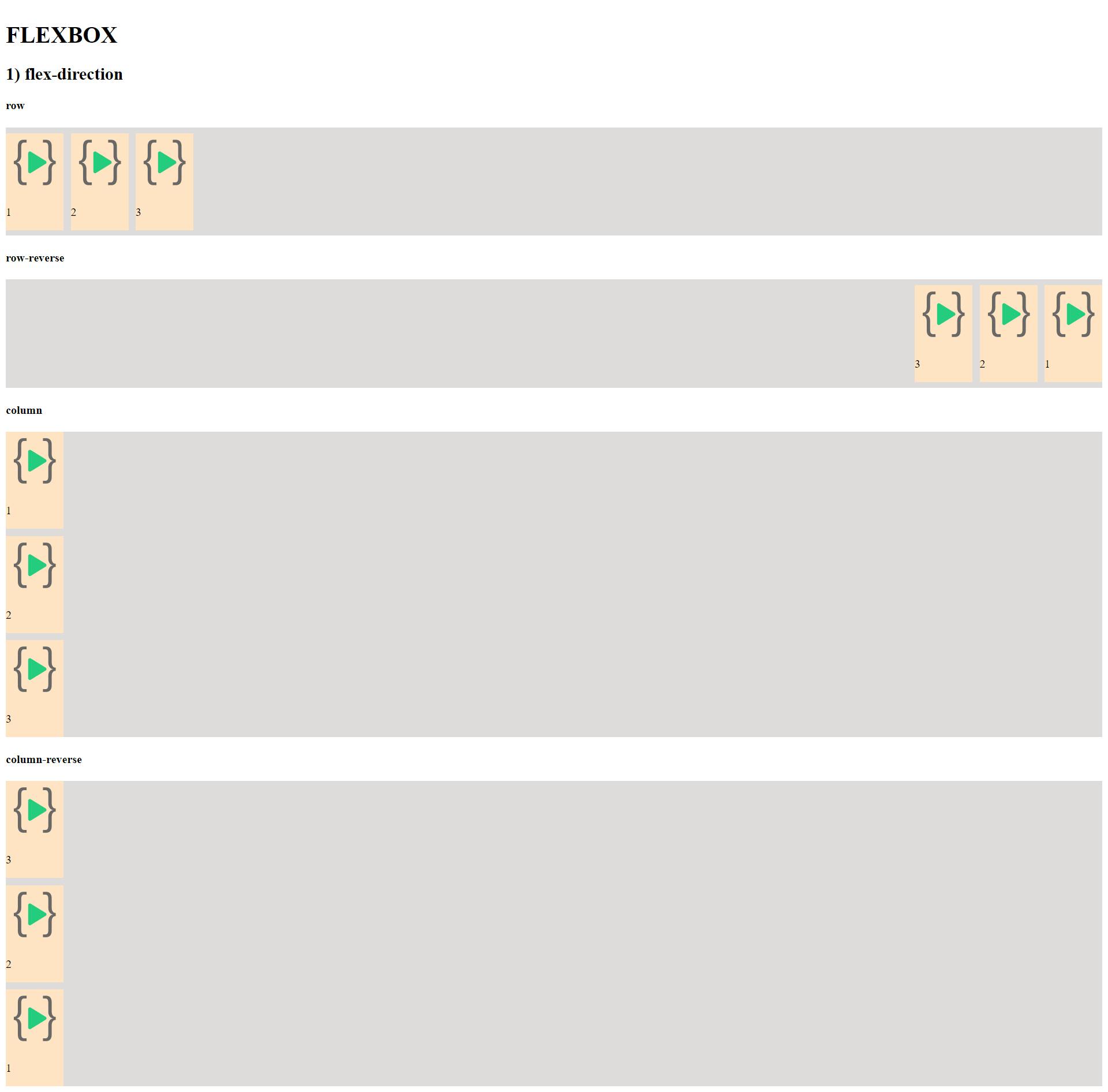
flex-direction
Flex items are placed in a row by default. To change this, set the flex-direction property to the column.
The flex-direction property controls the direction of the flexible items. row (default): left to right row-reverse: right to left column: top to bottom column-reverse: bottom to top
The flex-direction property can be used to create a row or column of items that are reversed.
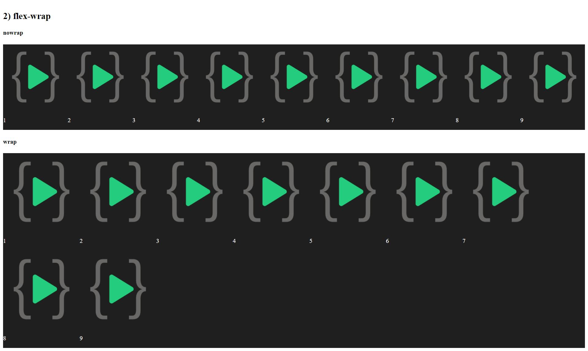
The flex-wrap property controls whether the flex items will wrap or not. wrap (default): wraps items onto multiple lines, from top to bottom wrap-reverse: wraps items onto multiple lines, from bottom to top nowrap: all items displayed on one line
The flex-wrap property can be used to control the direction in which the items wrap.
The flex-flow property is a shorthand property for setting the flex-direction and flex-wrap properties, which together define the direction and wrapping of the items.
The flex-flow property can be used to set the direction and wrapping of the items in a single declaration.
To specify the size of flex items, set the width or height property.
flex-wrap
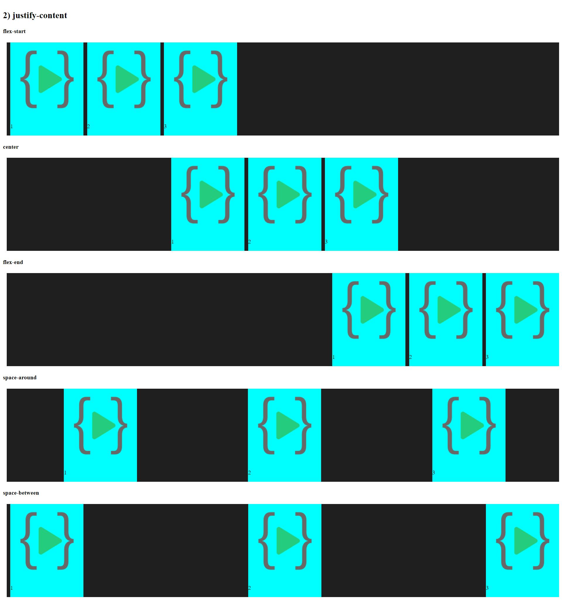
justify-content
To control how flex items are spaced, set the justify-content property according to main axis.
The main axis of a flex container is the primary axis along which flex items are laid out. The direction of the main axis is determined by the flex-direction property.
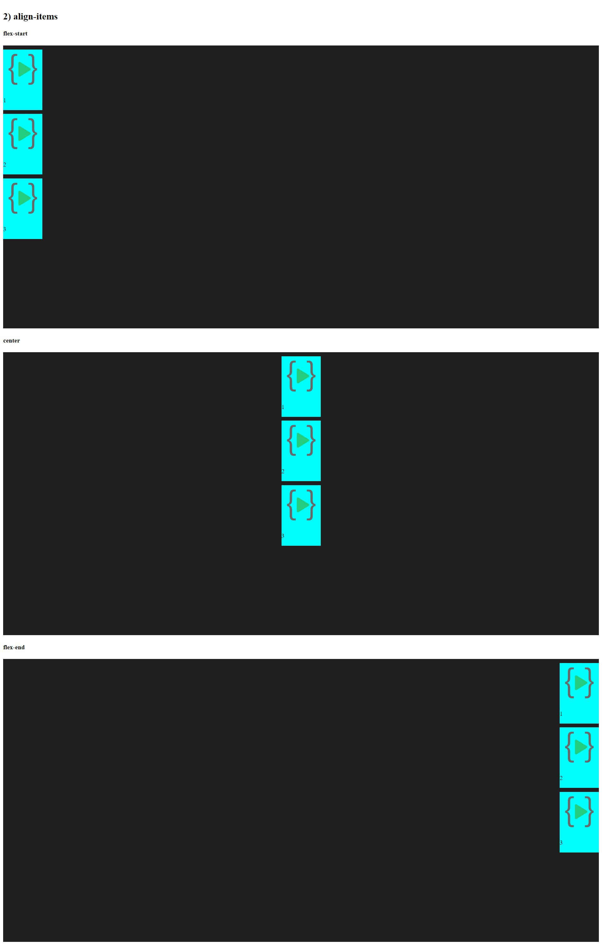
align-items
Happy Learning
#iwritecode